
Slant
Whether letters lean right, left or stand upright. Traditionally linked to how openly you express feelings.

AI handwriting analyzer
3+ lines work best. Leave out personal details.
Use your everyday handwriting, ideally on plain paper. Three or more lines give the analyzer enough to work with.
Take a sharp photo from directly above, or scan the QR code on a computer to snap it with your phone.
Get a short summary plus a card for each feature: what we noticed, and what graphologists traditionally associate with it.
Real sample report
This is exactly what the handwriting analyzer returned for a public-domain cursive sample on 11 November 2026. The full output is shown without edits, so you know what to expect before you upload. The sample is on ruled paper, which works, though plain paper makes spacing and baseline easier to read.
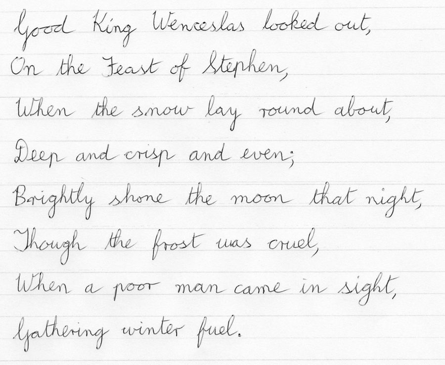
Taken together, these handwriting features may suggest an expressive, sociable and imaginative personality, with an appreciation for both connection and individuality. The flowing cursive and rounded forms are often associated with warmth and emotional expressiveness, while the relatively steady baseline and varied strokes may suggest a blend of consistency and spontaneity. The overall impression is of someone who may enjoy communicating creatively while maintaining a personal sense of independence. These are traditional graphological interpretations for entertainment and self-reflection, not scientifically established personality assessments.
Seen: Letters show a predominantly rightward slant, with occasional upright variations.
Traditional reading: In traditional graphology, a rightward slant is often associated with warmth, expressiveness and an outward-oriented approach to relationships.
Seen: Letter size is medium to large, with noticeable upper loops and extended lower strokes.
Traditional reading: Some graphologists associate medium-to-large writing with expressiveness, confidence and a preference for making one's presence felt.
Seen: Strokes appear relatively light to medium, with some darker and thicker downstrokes.
Traditional reading: This variation may suggest a balance between gentleness and determination in traditional graphological interpretations.
Seen: Letter spacing is fairly close, while gaps between words are generally moderate and consistent.
Traditional reading: This pattern is often associated with sociability alongside some appreciation for personal space and connection.
Seen: The writing follows mostly straight ruled lines, with slight natural waves and variations.
Traditional reading: A relatively steady baseline is traditionally associated with composure and consistency, while small variations may suggest spontaneity.
Seen: The writing makes generous use of the page, with a fairly consistent left edge and variable right endings.
Traditional reading: Some graphologists read this open page usage as a sign of openness and flexibility, with a willingness to let expression unfold naturally.
Seen: Letters combine rounded curves, elongated loops and flowing ascenders with occasional angular connections.
Traditional reading: Rounded forms are often associated with warmth and adaptability, while more angular strokes may suggest decisiveness and individuality.
Seen: The handwriting is predominantly connected cursive, with flowing joins and occasional separated letter forms.
Traditional reading: Connected cursive is traditionally associated with continuity of thought and an intuitive communication style. Occasional breaks may suggest moments of reflection.
The details in your writing
Visible features, explained clearly.
Whether letters lean right, left or stand upright. Traditionally linked to how openly you express feelings.

Large, medium or small letters. Often read as a hint about how much you like attention versus focus and detail.

The gaps between letters, words and lines. Commonly connected to how much personal space and structure you prefer.

Whether lines run straight, rise or drift downward. Often read as a reflection of mood and steadiness at the time of writing.
How heavily the pen presses into the paper, judged from stroke darkness and thickness. Associated with energy and intensity.
How you use the page, how rounded or angular your letters are, and whether they join up. Together these add nuance to the reading.
Short answer: no. Graphology has a long history, but it is not an accepted psychological test, and graphology is not used by psychologists to measure personality or job performance. That is why this site treats every reading as a prompt for reflection, never as a verdict.
Visible, checkable features: how much your letters lean, how big they are, how evenly you space words, whether your lines stay level. The analyzer describes these first, so you can check each observation against your own photo.
Your intelligence, honesty, health, age, gender or whether someone is a good hire. Handwriting also changes with mood, speed, pen and paper, so two samples from the same person can read differently.
Each reading is phrased as what graphologists traditionally associate with a feature, not as a fact about you. If a reading does not fit, trust yourself over the tool.
A vision model can describe visible shapes like slant and spacing in plain words. It does not make graphology more valid; it just makes the traditional associations quick and easy to explore.
Use the questions at the end of each reading as a writing prompt. Starting from something concrete, like the slant of your own letters, can make it easier to think about yourself.
Analyze a page from an old notebook and a page written today. Comparing the observations (size, slant, spacing) is often more interesting than the readings themselves.
Look closely at a grandparent’s handwriting or an old postcard, with the family’s permission. Remember the reading is a playful lens, not a portrait of the person.
The legibility rating and the notes on spacing and baseline give you specific things to work on if you want neater writing.
Handwriting analysis, or graphology, looks at how you write rather than what you write: the slant of your letters, their size, the pressure of the pen, the spacing between words and how steady your baseline is. Graphologists link these features to personality traits. Our handwriting analyzer uses AI to describe those features in your sample and offer a reflective reading for each one.
Graphology is not a scientifically validated way to measure personality, and we make no accuracy claims. Treat the reading as a fun, reflective prompt: notice which observations ring true for you and which do not. It should never be used to judge, hire or diagnose anyone.
Write three or more lines in your everyday handwriting on plain paper, take a clear photo from directly above, and upload it above. On a computer you can also scan a QR code and take the photo with your phone. The sample reading on this page took 72 seconds in our test run on 11 November 2026; times vary with the photo and the AI service load.
Write naturally, as if you were jotting a note to yourself. A few full sentences work better than single words or capital letters, because the analyzer needs to see letter connections, spacing and how your lines run across the page. Avoid copying text in a style that is not your own.
New accounts usually get one free analysis (limited per network to prevent abuse, so an account on a shared network may not get one). After that, analyses use credits from a one-time credit pack (1 credit = 1 handwriting or signature analysis); there is no subscription. If an analysis fails, the credit goes back to your balance automatically. See the pricing page for current packs.
Your photo is sent securely, checked by an automated safety filter, analyzed, and then deleted. Anything left in temporary storage by an error is removed automatically within 24 hours. We do not save your reading and we do not use your photo to train models.
No. The tool deliberately ignores what your writing says and only looks at how it is written. Please avoid uploading personal details such as addresses, account numbers or private letters.
Yes. Signatures follow slightly different conventions, so we have a dedicated signature analysis tool that looks at legibility, capitals, flourishes and underlines.
AI describes visible writing patterns. Traditional interpretations are for entertainment and self-reflection. Graphology is not a scientifically validated psychological test: do not use a reading for hiring, medical, legal, financial or any other decision about yourself or others, and do not upload someone else’s writing without their permission.
Letter shapes, spacing, slant and connections.
A starting point for reflection, never a verdict.
Want to look at your autograph instead? Try our signature analysis tool.
Built and maintained by William ZZ, Founder.